



Shady vs Shady 2
Ten pages, side by side
Shady 2 gives your music more space. Search moves into the header, the sidebar can collapse, and the player floats above the bottom edge.
Switching themes keeps your pages and catalogue. Phones still use Shadyf0n.
Shady is on the left; Shady 2 is on the right. Tap an image for full size.
Home
Headlines sit over darker artwork, with rounded action buttons.
Shady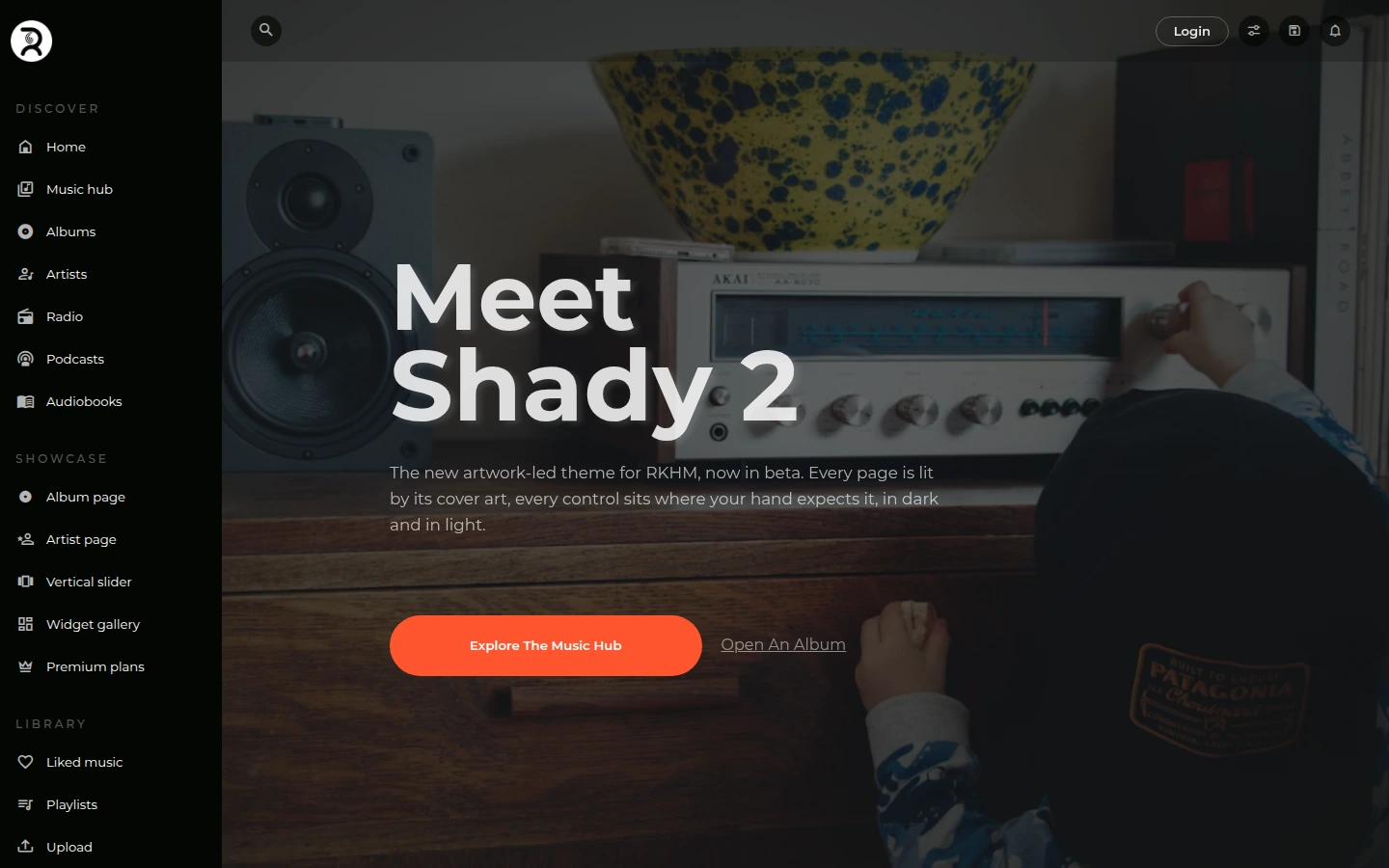 Shady 2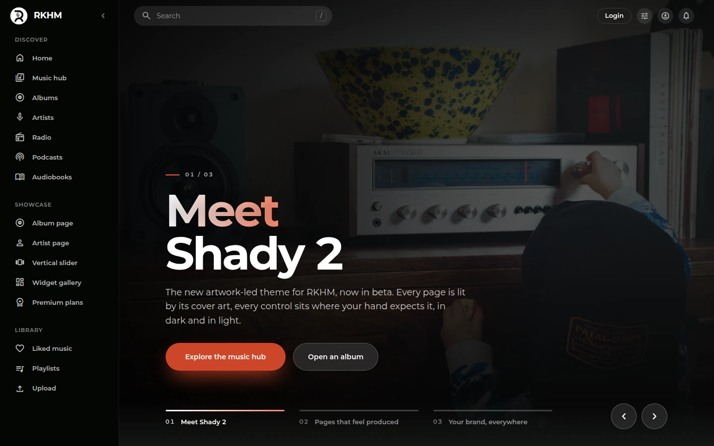
Widget gallery
Larger covers without filled card backgrounds. This example uses AI artwork and fictional names.
Shady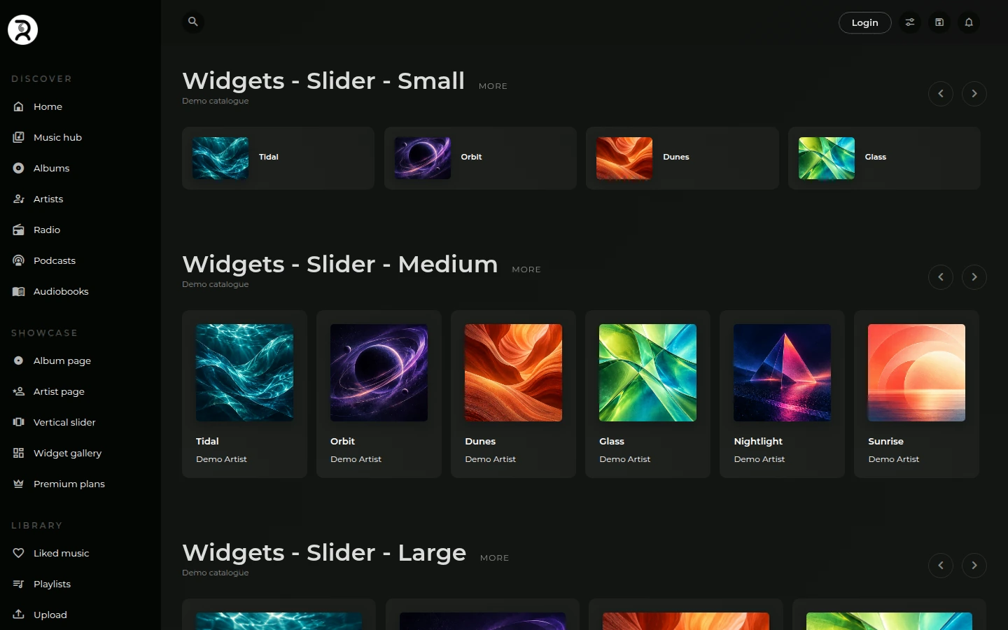 Shady 2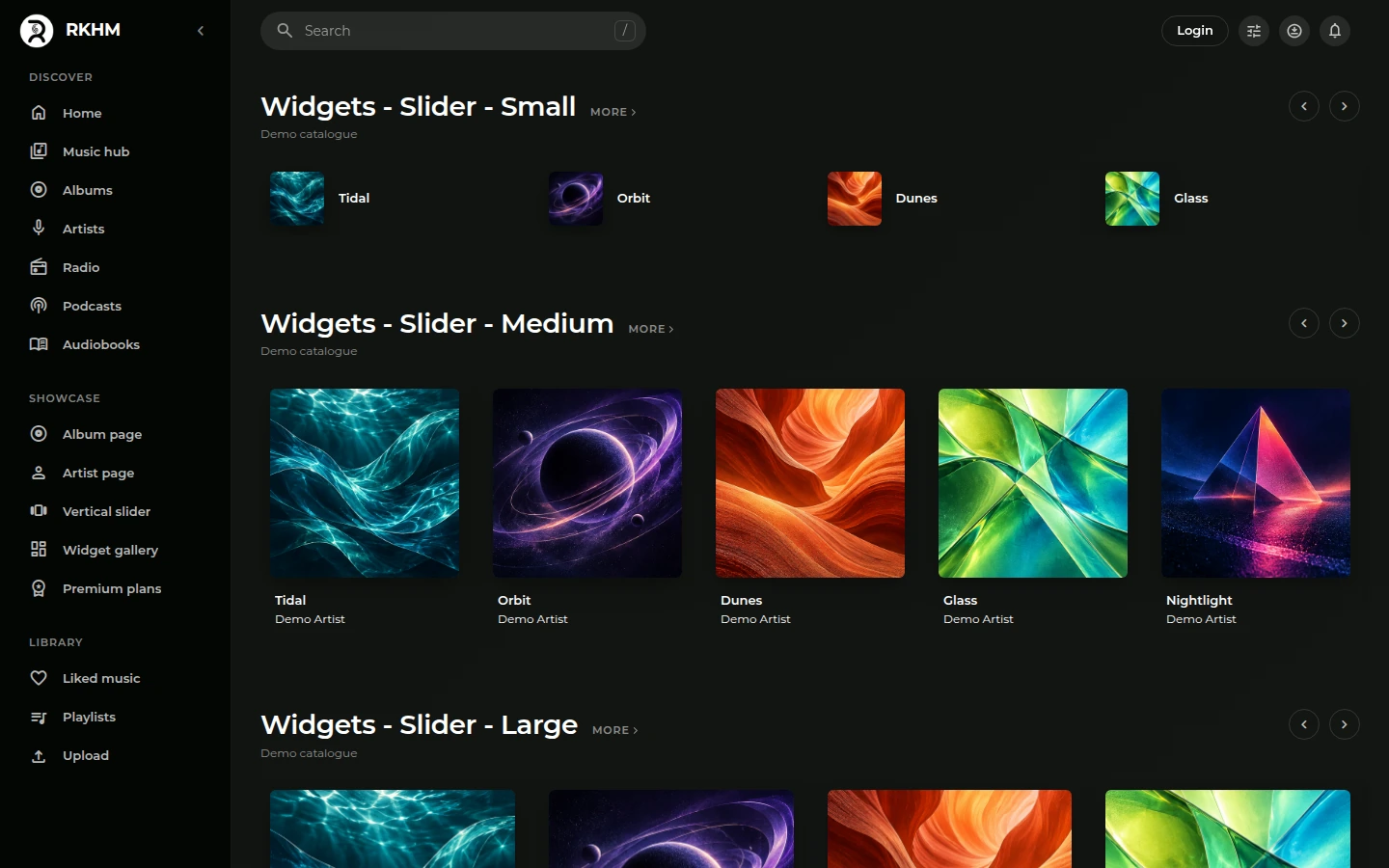
Browse
Artist photos become round; filters sit in a compact panel.
Shady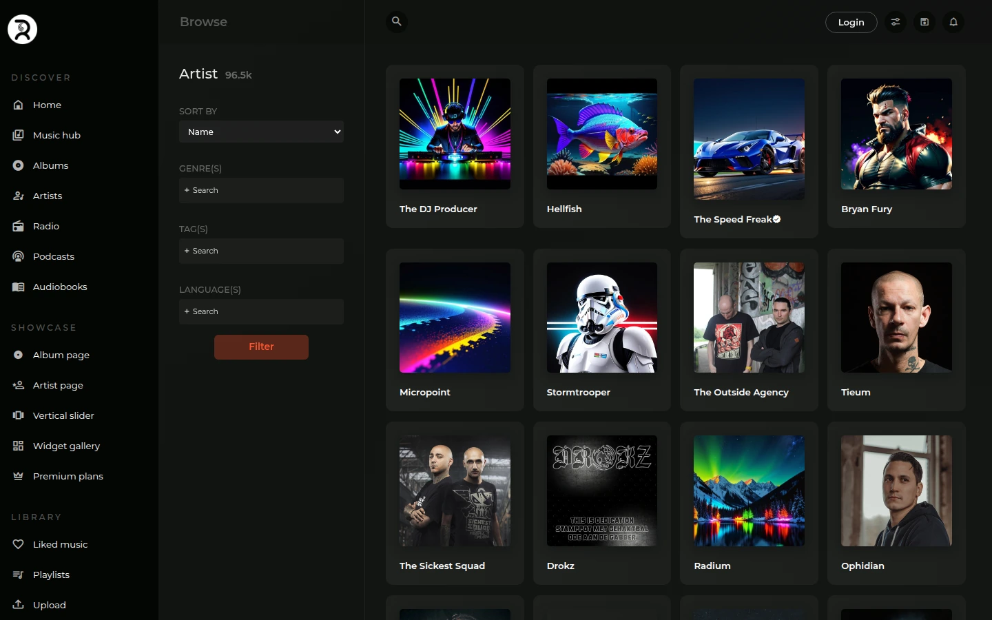 Shady 2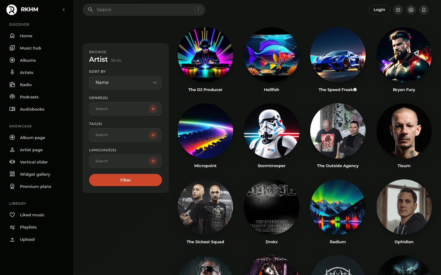
Album
Track lists show artwork, play counts and durations in separate columns.
Shady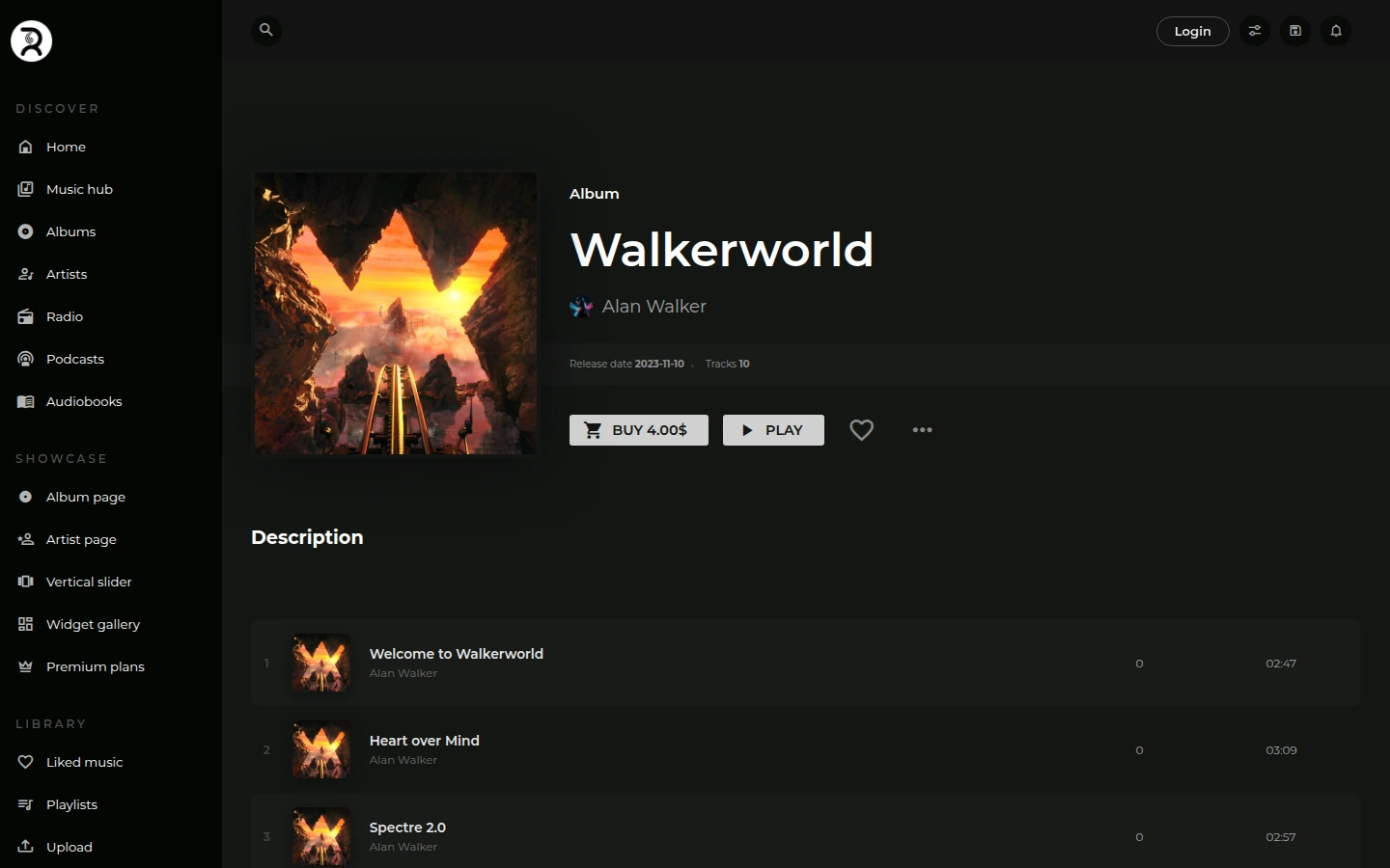 Shady 2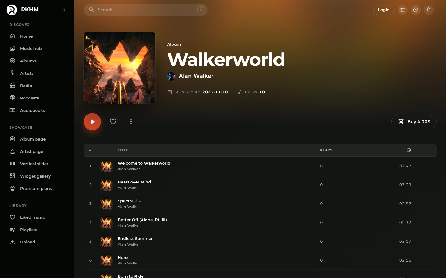
Artist
The artist’s picture and name sit together above their releases.
Shady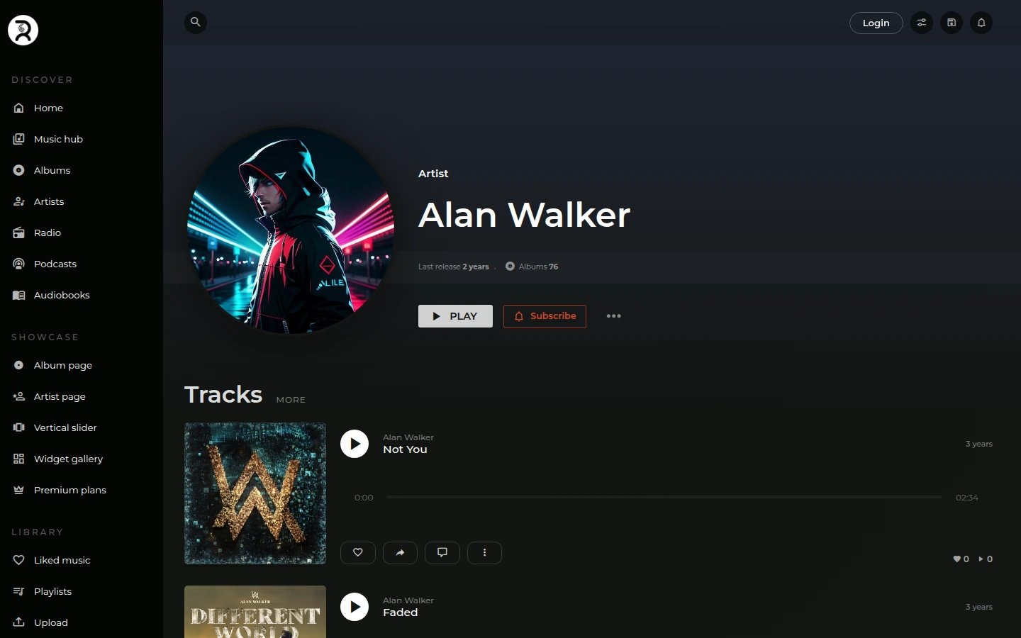 Shady 2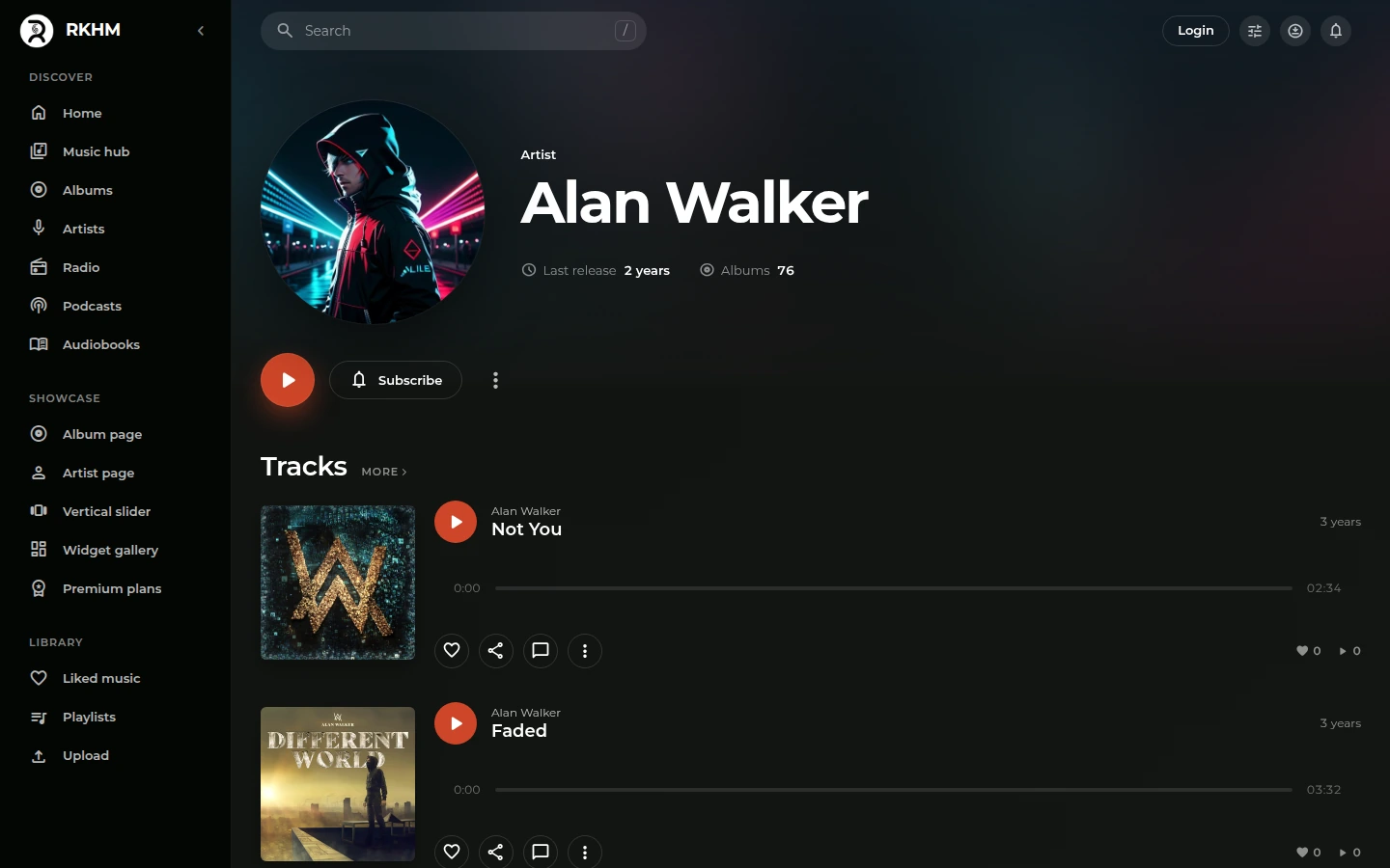
Track
The artist, album, and track details sit together above the waveform.
Shady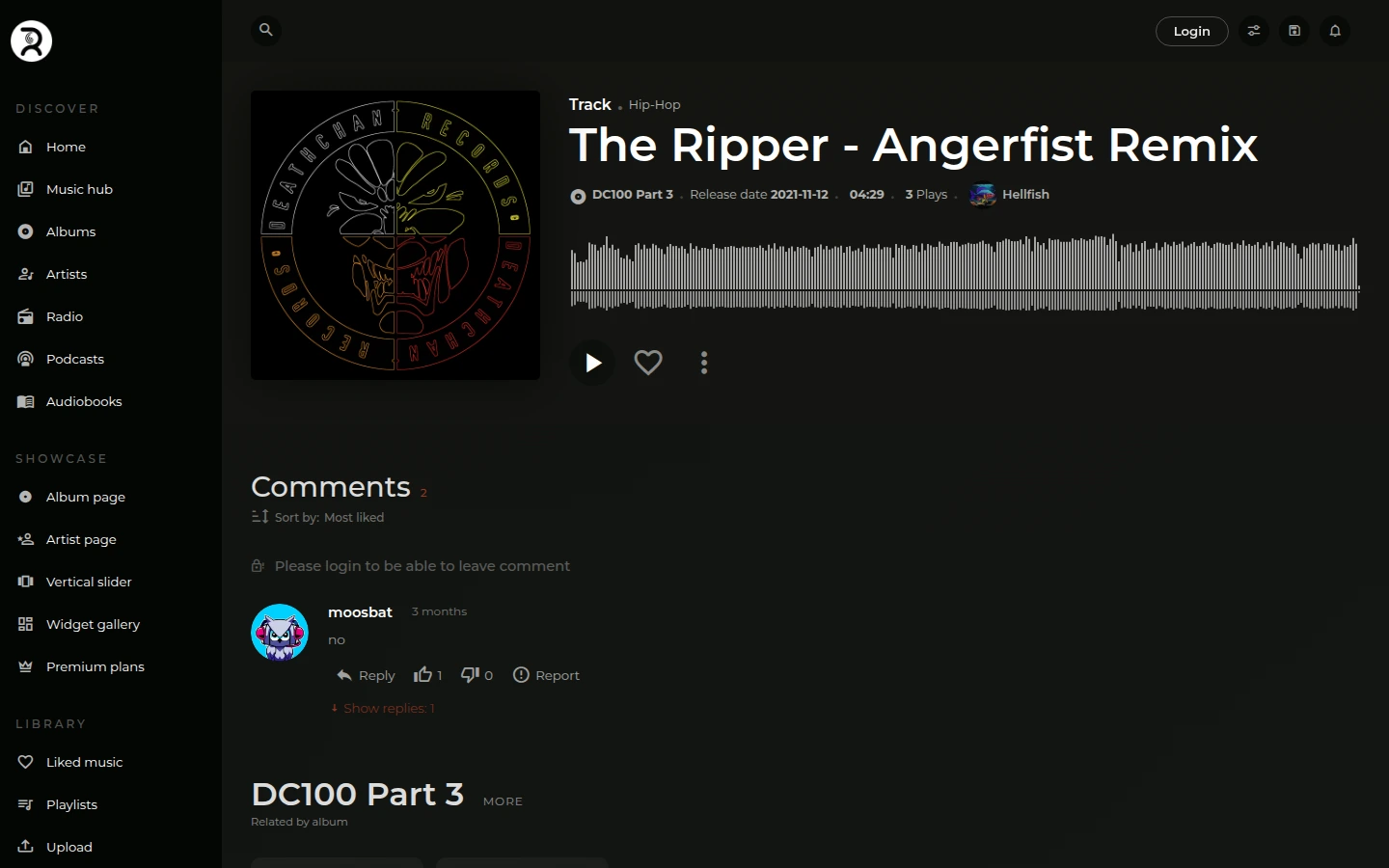 Shady 2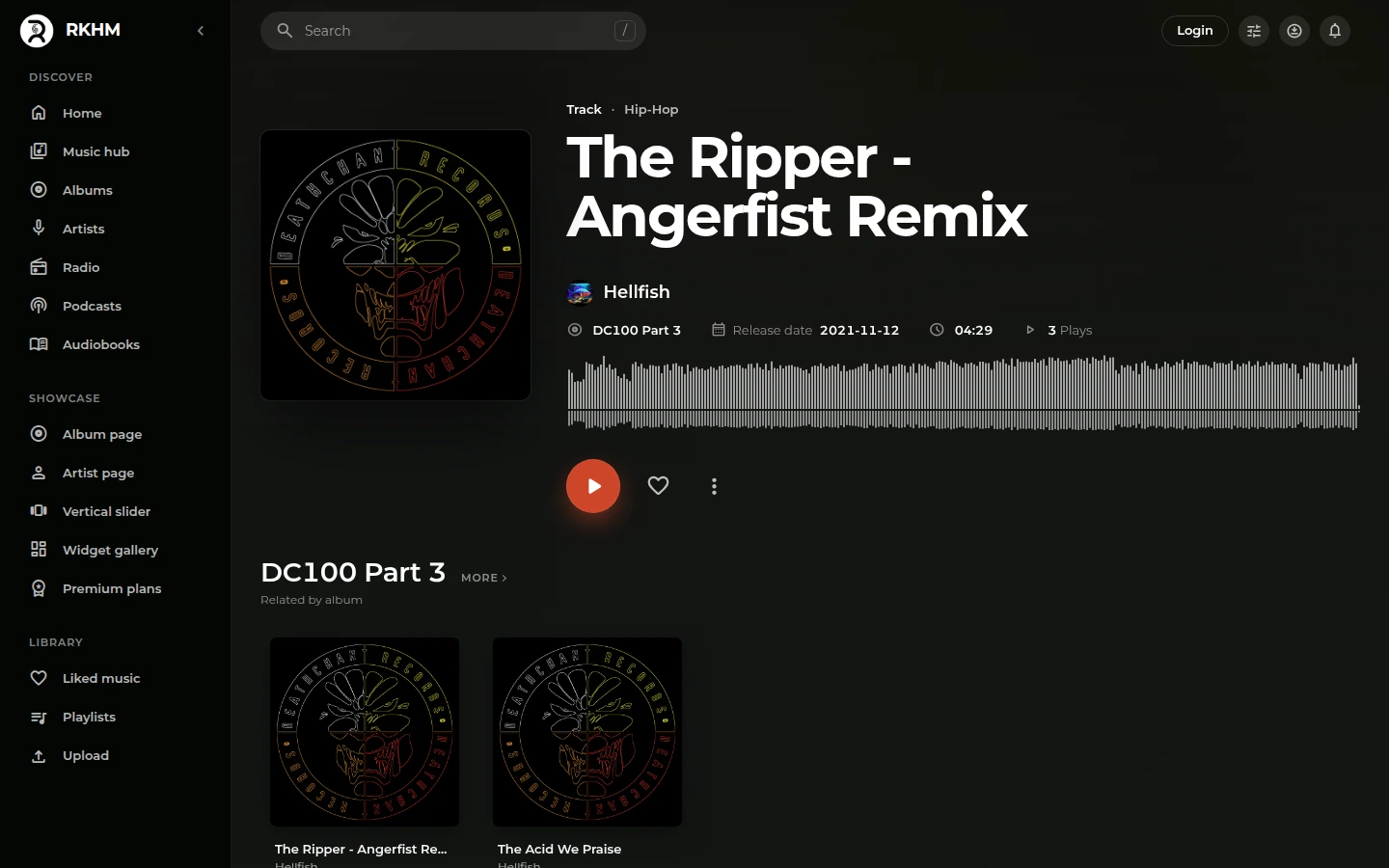
Radio
External stations get a highlighted notice with a link to their website.
Shady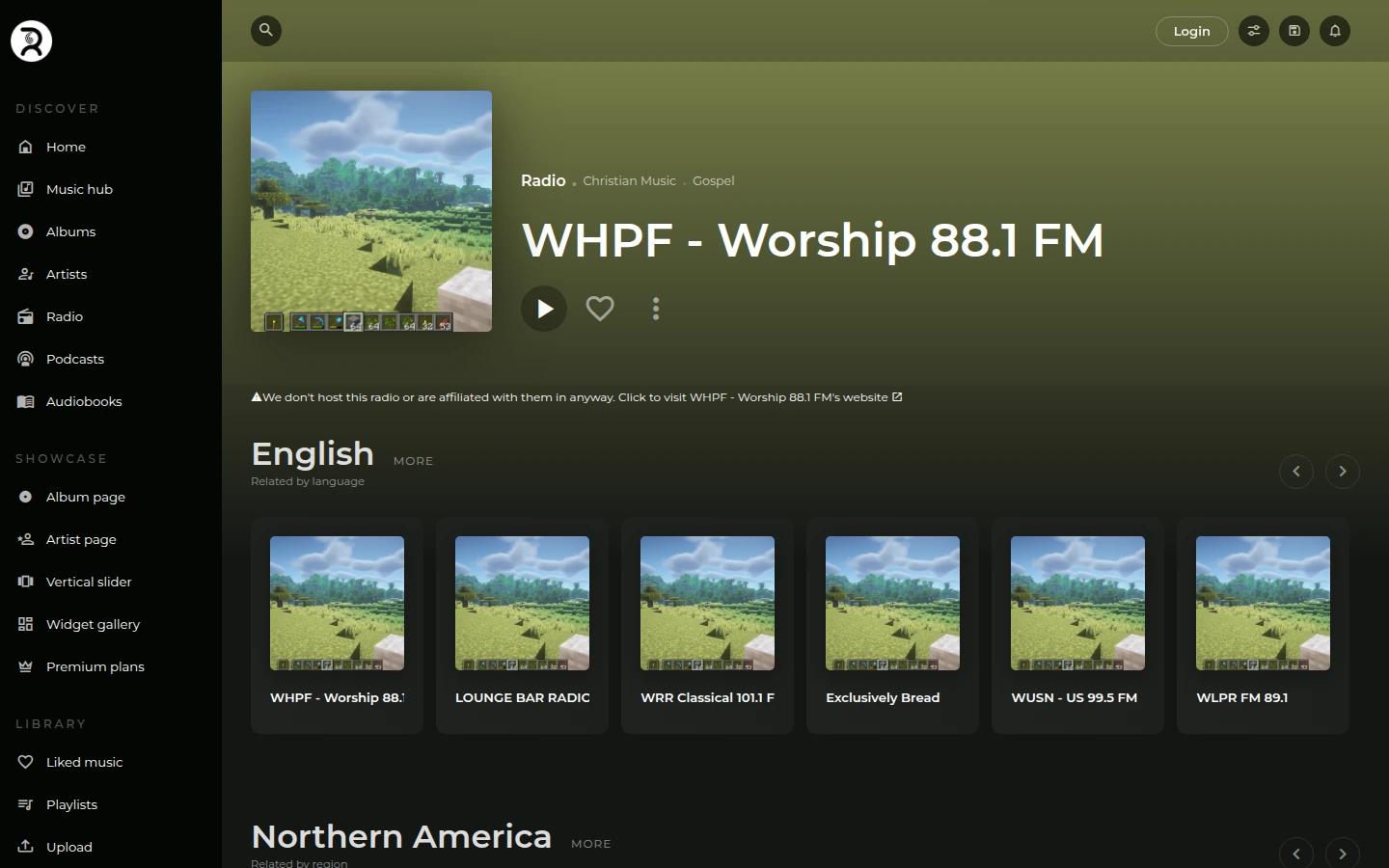 Shady 2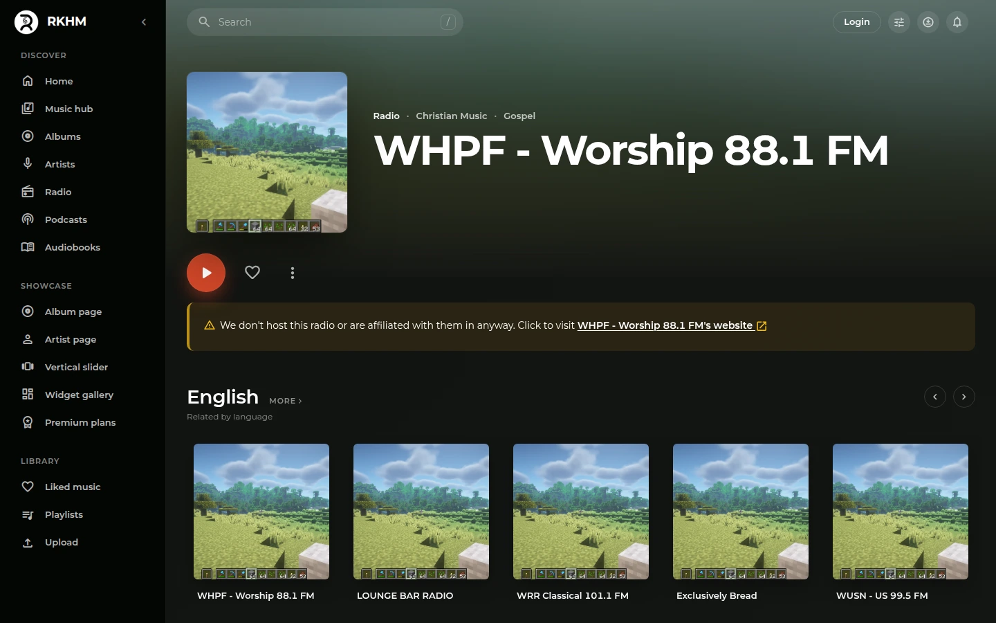
Beats
Licences, file formats and prices line up in rows.
Shady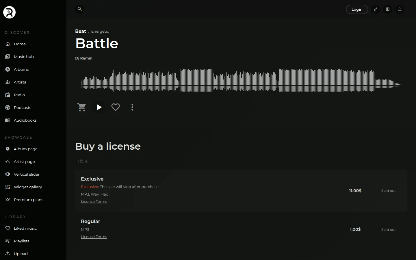 Shady 2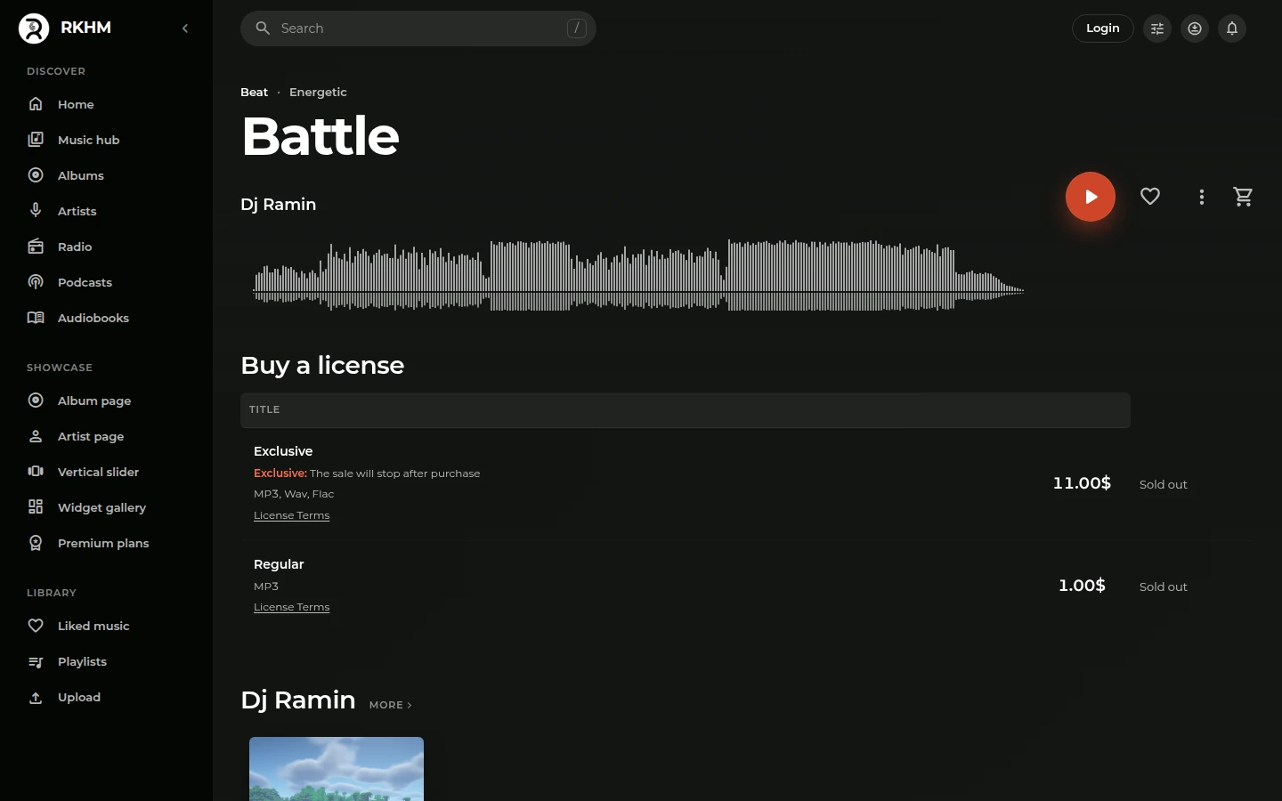
Plans
Plan choices sit beside the benefits, with the price repeated by Confirm.
Shady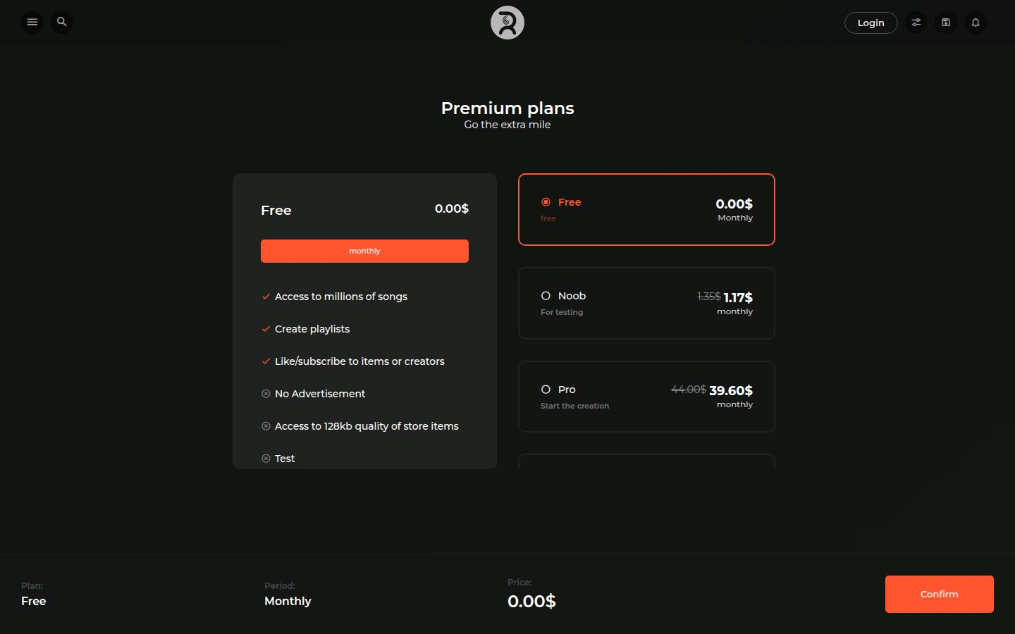 Shady 2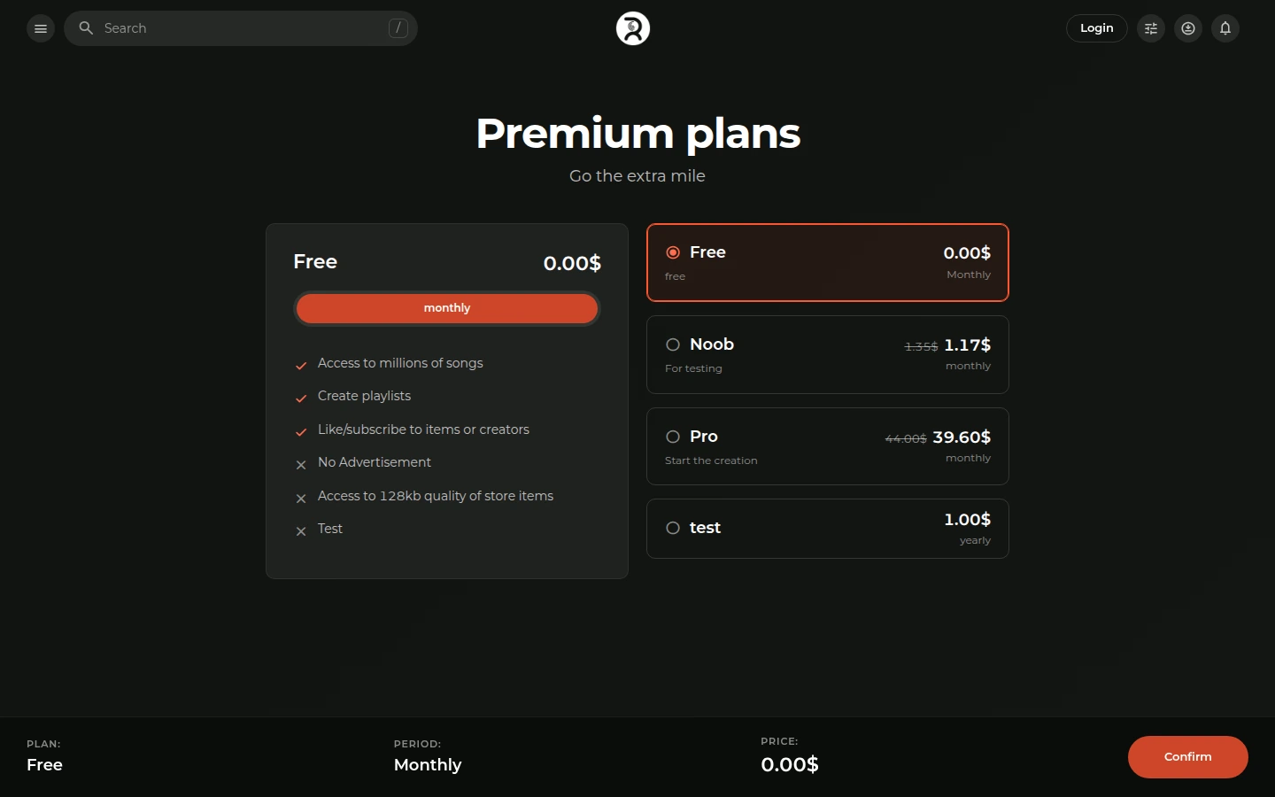
Login
The split screen becomes a centred login form with larger fields.
Shady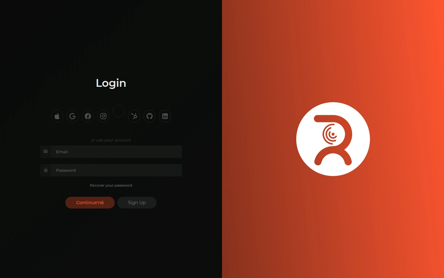 Shady 2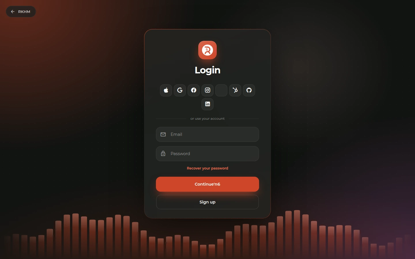
To try it, install Shady 2 and select it for Desktop in Theme Manager. You can switch back to Shady there too.